Designing with a grid
You may think that the layout of any particular design is purely left to the designers whim and, although some elements may be nicely aligned, mostly they are placed on the page or screen wherever the designer feels like it.
In many cases you’d be right, but this is not how things should be …
Introducing the grid system
A grid system in its simplest form is a series of vertical and horizontal guide lines to aid the layout of elements on a page or screen.
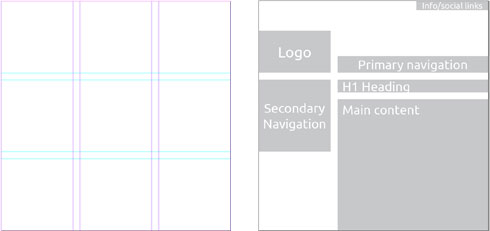
Here is an example of a basic 3×3 grid including gutters between the grid areas to provide consistant spacing between elements. On the right I’ve quickly laid out a very simple website structure which uses the grid and places the important information (the main header and content) at one of the four focal points the grid provides (the corners of the central square).
Even this very simple grid provides a good organisation of content and space, making your design more usable and accessible. So when we start to think about a new design we will always sketch out the content onto a few grid options to see what grid will best support the content.
One flexible grid system that works well on the web is the 960 grid system. This system has been designed to fit a screen size of 1024×768 pixels where 960 pixels is the usable space left when scroll bars and things are taken into account. Within the 960 pixels it’s up to you how many columns you have and this would depend on what the content needs.
Examples of grids in action
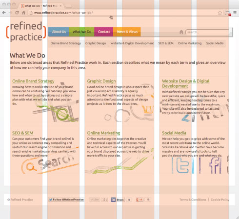
Here are a couple of examples of websites we’ve designed showing their underlying grid structure. You can see that most elements will span many columns and sometime we break out of the grid structure to include overhanging elements – see the brackets on the refined practice logo and header bars of the ifs design.

As always there is much more that can be said on the subject of grids in design, but I’m afraid you might hurt your head when you fall asleep on your keyboard. If you are interested and want to read on then check out these websites:
- www.thegridsystem.org – a great one stop shop for everything grid related.
- 960 Grid Systems – for some easy to use web grids
