Visualising UK Ministerial Lobbying & “Buddying” Over Eight Months
[This is a companion piece to our visualisation of ministerial lobbying – open it up and take a look!].
The Murky World of Lobbying:
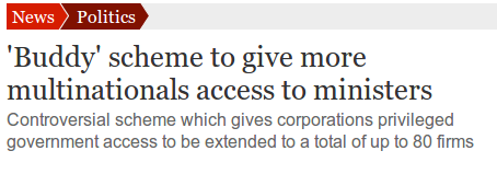
Back in January 2013, the Guardian published the following piece about a scheme (entitled “buddying”) that granted access to the heart of UK government to various multinational companies:
This seemed like lobbying on steroids, so I contacted one of the authors of the piece (James Ball) to find out what data the story was based upon.
Eight Months Worth of Lobbying Data
Turns out that James Ball, together with the folks at Who’s Lobbying had collected together all the data regarding ministerial meetings from all the different departments across the UK’s government (during May to December 2010), tidied the data up, and put them together in one spreadsheet: https://docs.google.com/spreadsheet/ccc?key=0AhHlFdx-QwoEdENhMjAwMGxpb2kyVnlBR2QyRXJVTFE.
It’s important to understand that despite the current UK government stating that it is the most open and transparent ever, each department publishes its ministerial meetings in ever so slightly different formats. On that page for example you can see Dept of Health Ministerial gifts, hospitality, travel and external meetings January to March 2013, and DWP ministers’ meetings with external organisations: January to March 2013. Two lists containing slightly different sets of data. So, the work that Who’s Lobbying and James Ball did in tallying this data up is considerable. But not many people have the time to tie such data-sets together, meaning the data contained in them is somewhat more opaque than you might at first be led to believe. What’s needed is one pan-governmental set of data.
Making the Data Accessible
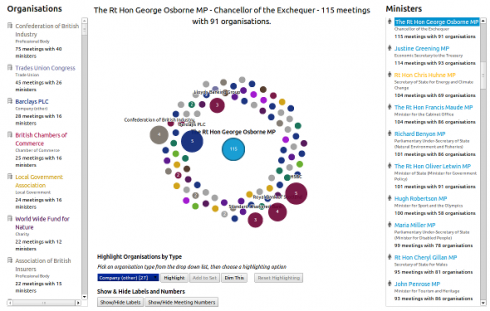
What we wanted to do was make it very simple to view which ministers had the most meetings during the eight months and who they had meetings with; and likewise view which organisations had the most meetings and with which ministers. So, we took the data and created a visualisation of who met whom. The results are intriguing.
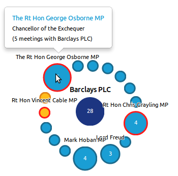
If you open up the visualisation you will see that the left of the page lists organisations and the right lists ministers – all in order of the number of meetings. Ministers are coloured blue for Conservative, and Yellow for Liberal Democrat. Organisations are coloured by their type, e.g. charity, media organisation, etc. The size of a circle represents the number of meetings, and you can just keep on browsing and exploring the data by clicking on a circle.
In some cases, e.g. meetings with Chris Grayling, there are many organisations and many meetings. To make it easier to dig into the data, we’ve provided options at the bottom of the visualisation…

… so that you can highlight organisations of a certain type (in the example below – charities):

You can also highlight multiple organisations, show/hide labels, and more. If you’re interested, full technical details of how we built the visualisation using d3.js can be found here.
Some Interesting Findings
Below are a few things we discovered in the data:
- Some ministers had a huge number of meetings over eight months: David Willetts had 341 meetings; Ed Vaizey had 296 meetings. In the case of David Willetts, that’s almost 1.5 meetings a day. If you factor in internal meetings with civil servants and with colleagues, and a bit of time for just a little of actual work … that doesn’t leave much time for his poor constituents. It would be great to be able to access this data over a longer period of time, and see if he sustained that meeting rate. It can’t be a very effective way of working: at the very least time is needed to absorb the impact of a meeting, and make decisions, formulate plans, etc.
- If we look at organisations, it’s interesting to see how busy Barclays Bank was during this time. I’m sure many of us would love to see the minutes from these meetings, some of which appear to be a bit odd: what was Lord Freud, minister for Welfare Reform doing meeting Barclays Bank?
- It’s also important to note that this visualisation is very much a quantitative analysis (i.e. how many meetings a minister or organisation had), rather than a qualitative analysis (how important, or how effective). A good illustration of this is how Rupert Murdoch had only one meeting … which was with David Cameron. Oh, to be a fly on the wall in that meeting.
Let Us Know What You Find
Finally, there’s a fair amount of data here, so please let us know what you find: what surprises you, appalls you, or you just find interesting.
Leave a comment below, get in touch with us here, or drop us a line on social media (links below) – we would love to hear from you! You may also be interested in how we made this visualization and our easy to use interactive charting tool.
