How We Made the Ministerial Lobbying & “Buddying” Visualisation
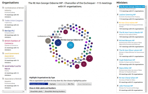
We’ve just published a visualisation of over 6,000 meetings between 100 UK government ministers and over 3,500 organisations that took place during the eight months from May to October 2010. In this post we discuss some of the techniques we used and the technical bits’n’pieces behind the visualisation. If you wish to know more about the content, see this blog post that discusses the content in detail.
Built Using
We put the visualisation together using the following software:
- Python (& a bit of PHP): For data cleaning, organising and categorisation.
- crossfilter.js: For querying and manipulating the lobbying data in the browser. This library was (and still is) extremely handy.
- d3.js: For the bulk of the visualisation itself.
- jQuery: For the popup titles, and for the highlighting functionality.
First Task: Cleaning & Formatting the Data
The original form of the base data we used was a CSV (downloaded from https://docs.google.com/spreadsheet/ccc?key=0AhHlFdx-QwoEdENhMjAwMGxpb2kyVnlBR2QyRXJVTFE) formatted as follows:
"department","minister","minister_role","date","wl_normalized_name"

"Attorney General's Office","Dominic Grieve QC MP","Attorney General","Nov 2010","Peace Brigades International"

"Attorney General's Office","Dominic Grieve QC MP","Attorney General","Nov 2010","Kaku Hirao "

"Attorney General's Office","Dominic Grieve QC MP","Attorney General","Oct 2010","Dr Sophie Turenne "
From this we wanted to produce a JSON file that contained:
- A list of organisation types (ID, CSS friendly name, full organisation name).
- A list of all organisations with each organisation having: an ID, a CSS friendly name, the full organisation name, organisation type ID.
- A list of all ministers (ID, name, title).
- A list of all meetings: meeting ID, organisation ID, minister ID, date of meeting.
The identification of the organisation types isn’t as complete as it could be, but we had to draw the line as to how long we put into this, so we used a semi-automated process of comparing the organisation names to lists of lists e.g. companies on the FTSE, Forbes top 2000 global companies, lists of known think tanks and charities, and so on. This was all from freely available data. In the end we identified well over half of the organisations in the list.
We then had an automated script that organised the data accordingly and spat out the JSON file. It’s often the case with any data analysis project that the formatting of the data takes a few iterations, and this was no exception.
The Visualisation Itself
The core part of the visualisation, the floating and animating circles is built using reusable d3.js, using a very similar “MV*” approach as covered in the following Writing Reusable D3 Code article I wrote for Safari Books, and using techniques outlined in the Developing a D3.js Edge book (of which I am a co-author).
Essentially, the code breaks down into one main controller component that calls a whole set of other utility components (e.g. JSON component, the standard D3 force layout component, and others …).
This particular visualisation took inspiration from the following Force Bubble Charts in D3 post.
And Don’t Forget jQuery
The handy popups (when you rollover each circle) were implemented with jQuery (where would we be without jQuery?), as are the onscreen controls for highlighting organisation types, show/hide labels etc. A rigorous approach to making sure everything in the D3 chart has a sensible CSS class (and ID) makes this relatively easy to implement, and also means that a lot of the look of the final visualisation can be controlled using CSS and hence easily changed or updated without having to dive into the D3 code.
Do Let Us Know What You Find
We feel like we’ve only really skimmed the surface of this data, and we really wish we had more of it over a longer period of time. So, if you find any interesting (and peculiar meetings) do please let us know.
Leave a comment below, get in touch with us here, or drop us a line on social media (links below) – we would love to hear from you! You may also be interested in reading about our D3.js based charting tool.
