Visually disruptive overlays AKA “those irritating pop-up things that seem to be everywhere nowadays”
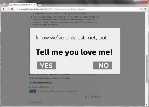
Visually disruptive overlays are the new pop-up. You know the things I mean – you’ve followed a link to what looks like an interesting article, but as soon as you load the page the content you actually want to see is covered by a semi-transparent overlay exhorting you to profess your undying love for the site, even though you haven’t read a single word of its content yet. It’s not quite as annoying as being forced to sign in using Facebook before you’re allowed to see anything but sometimes it gets close. It’s about this annoying:

Now, I can definitely see the purpose of these overlays, especially now that an increasing amount of visits to websites are driven by posts on social media. As site owners we need to attract people in to our content longer term rather than having them pop in, read a single article and then disappear into the ether(net) never to be seen again. The problem as I see it is that most of them are poorly designed, inaccessible to users with disabilities and have been implemented with no thought to how a user actually interacts with a website. As such they tend to be counterproductive, annoying more potential long-term visitors than they gain. Let’s look at the four main problems:
1. The instant “love me”
The majority of these overlays trigger as soon as the user visits the web page, or (even worse) within a couple of seconds of arrival. If the overlay then asks you to sign up for a newsletter or follow the site on social media (as it often does) then that’s an instant fail in my book. Why would the user do this when they haven’t even seen your content yet? If you can’t be bothered to think about how someone might use your site then I’m not impressed.
Lesson: Don’t ask the user to love you too early, let them get to know you first.
2. The persistent nagger
Why trigger an overlay once when you can trigger it on every single page you view? That seems to be what a lot of designers think. Doing this is a great way to encourage people to leave your site, not read more of it.
Lesson: No means no, don’t keep asking.
3. “Catch Close me if you can, I’m the Gingerbread Man Overlay”
Hmmm… that section title sounded better in my head… Anyway, pressing on! I frequently browse the web using the keyboard rather than the mouse, I (usually) find it faster. But it’s not just me, there are a lot of people out there who find it difficult or even impossible to use a pointing device like a mouse and so use a switched input device like a keyboard instead. The vast majority of these overlays assume that we’re all mouse users out there and ignore the position of the keyboard focus when they are triggered. The upshot of this is a lot of angry keyboard users frantically hitting the tab key in a vain attempt to move the focus to the close button of the overlay, which may not even be possible. At which point they will likely just close the browser tab and never visit your site ever again.
Lesson: Think of the children keyboard users! (again, better in my head than on the page…)
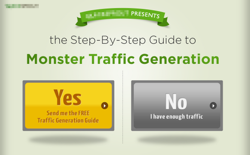
4. The hard sell
Not so much to do with technical implementation as with the content of the overlay itself. There’s a small minority of sites out there with overlays that really put on the hard sell. Take this example:
And this one:
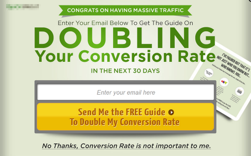
Trying to make your potential customers feel stupid/inadequate is not a pleasant tactic, even in an overlay.
Lesson: Don’t be a d#@k
So, what to do?
Like I said at the start, I think there is a time and a place for these overlays, you just need to implement them properly. So, you need an overlay that gives the user time to get acquainted with your content, doesn’t nag, is keyboard accessible and doesn’t treat the user like an idiot. Surely that’s not so hard? Turns out that no, it isn’t, in fact there’s one on this very page! You probably haven’t met it yet, but when you do please be kind and when it asks you to love us at least let it down gently…
Oh, and if you want one of your very own, here’s how to build a non-annoying, keyboard accessible overlay using jQuery. What you put in it is up to you, but remember, don’t be a d#@k.
