Tips for Choosing a Typeface
With as many typefaces as stars in the sky, how do you come to a decision of which typeface to use for your project? Here are some useful areas of thought that we would consider when starting to put design ideas together …
Context – In what environment will the type be used?
Will your chosen typeface be used on screen or in print? Is it for a website that will be viewed on multiple devices or are you designing a printed book? Of course more and more these days, when designing for a brand you will be expected to find a typeface that will work well across all kinds of media at the same time, for example a magazine publisher will probably want an article to look the same in print as it does online, so their type choice will be required to work everywhere to some extent.
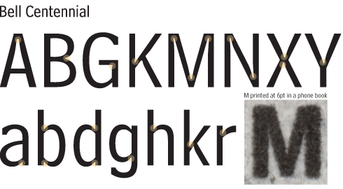
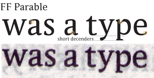
Typefaces have often been designed for specific uses. A typeface designed for a long text in a book will have vastly different features to that of a typeface designed for use as a newspaper or website headline. A typeface designed for screen use may have taken into account the size of a pixel at different resolutions – though this is now becoming less necessary with the quality of displays being produced and the fact that on some screens the eye doesn’t notice pixelation at typical reading distances – where as a print typeface (especially at small sizes) may have considered ink bleed in its design.
Content – What is the message the type will carry?
No matter what you are designing, there is always a message to get across. This may be the story of the book, the claims of an advert or the ethos of a brand. A typeface can either help or hinder this message. Beatrice Warde, in her essay of typography entitled The Crystal Goblet gives reference to a clear vessel holding wine, where the vessel, the printed word, gives no obstruction to the presentation of its content, the text. This doesn’t mean that typefaces must be plain and give nothing away, but that they must bear relation to the content they carry and so become invisible to the reader.
Clarity – How important are legibility and readability?
Depending on the message that needs to be put across, varying levels of legibility and readability will be required. If the overall message is simply “AAHHHH LOOK AT ME!”, then being able to decipher the actual characters and words used may not be as important as attracting the attention in the first place – high impact can reduce the need for high legibility. On a road sign, for example, letters and words need to be quickly and easily recognisable from distance and at speed. You don’t want to distract drivers from the task of driving, but you do want to provide information quickly and efficiently. Typeface choice is crucial.
Client – Any restrictions?
You may of course be told what typefaces have to be used, in which case your choice will be moved from what typeface best suits the project to how best to use that typeface in different layouts. If the typeface chosen for you doesn’t quite fit the requirements, perhaps in your opinion anyway, you’ll then be searching for the optimum use of that type. Find out what it was designed for, find its history, who created it and when. All of these things will help build a picture of the typeface’s best use.
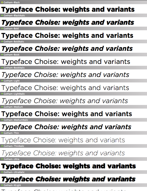
Given the chance to be making the typeface choice for your client, are there any limitations your clients are giving you? e.g. cost, some typefaces can be expensive especially if you require the full set of weights and variants – A typeface family may include different weights; light, regular, semibold, bold, extra bold, compressed, expanded, plus the italic of each weight. It may also include other variants; non-ranging numerals, dingbats/symbols/ornaments, swash.
Perhaps going full circle to context, where does your client need the type to be used? Does it need a web licence as well as a print licence – most type foundries and retailers sell both print and web licences these days with easy ways of implementing them for example @fontface
Character set – Does the typeface have all you need?
Think through some of the possible applications of the typeface. Will you need multiple weights and italics for different information in your design? Do you need a typeface with non-ranging numerals (numbers in lowercase)? or do you have to option to switch to ranging numerals (normal numbers) where needed? Do you need a bunch of swash characters or a set of ornaments? What about non-english characters, if your design is translated into another language does it have the character set to cope? – if you’ve downloaded a freebie it may not.
This article is by no means exhaustive, but we hope it gets your mind going in respect to where to start choosing an appropriate typeface for your project or brand.
