Charting & Visualisation in a Refined Way
Here at Refined Practice we’ve been busy working away on a little project involving the D3.js javascript library. D3.js provides a large set of tools to help visualise data online in the form of interactive visualisation, charts and diagrams. We love D3.js, it’s great – in fact founding partner Roland Dunn loves it so much he’s co-written a book about it (along with Christophe Viau, Andrew Thornton and Ger Hobbelt).
Our D3.js project is still in its infancy, but we thought we would share some of our early work with you.
So, what is it all about?
D3.js is a great way to create visualisations, which can be of immense complexity (take a look at this example). However, using it requires a level of technical knowledge of javascript and other technologies that most people will not be comfortable with. So, we are working on a way to make it easy for people who do not have that technical knowledge to create visualisations using D3.js and embed them in their websites – we’re calling it Refined Charts.
The goal is to be able to set out your data in a familiar spreadsheet environment and create great visualisations and charts that you can embed into your WordPress post or other webpage in D3.js format with a click of the mouse, whilst also providing a standard image version for older browsers and use in printed work (raster .png or vector .svg format).
Think big, start small
When working on a project like this it is important to get the basics right before moving on – “think big, start small” is our motto. So, we are starting off with some simple charts of the styles that you frequently use in spreadsheet programmes like Microsoft Excel.
Below is our first example. The chart below shows the percentage of visits to one website from desktop, mobile phone and tablet web browsers in the month of May 2013:
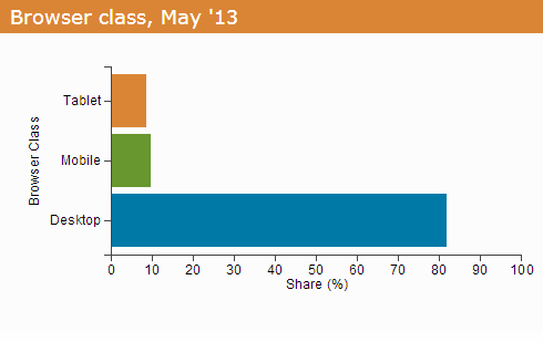
View as horizontal bar chart | View as vertical bar chart | View as pie chart
The chart is generated from data taken from Google Analytics and pasted in to one of our D3.js templates (no knowledge of javascript needed for the end user – nice and simple). If you are using an older browser (Internet Explorer 8 or below) then you will just see a simple bar chart image above. If you are using a more modern browser then you get the fun part! Move your mouse over the bars in the chart to see the exact figures used to build it, and use the links above to see the same data represented in different formats.
Taking it to a new dimension
Simple bar and pie charts like the one above are great, but they are restricted to two dimensions of data. If you want to look at how this data has changed over time you need a different chart.
Below is a multidimensional line chart showing how the visits from desktop, mobile and tablet browsers to the same website have changed over the past twelve months:
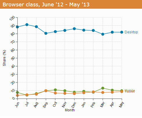
All data | Tablet & mobile | Tablet & mobile, smoothed | All data, smoothed
Again, if you are on an older browser you can see the basic chart with all the information you need, but if you have a more modern browser (most people do) then you can get a little bit extra. Run your mouse over the dots on the chart to see the base data for each point and use the links below the chart to zoom in for a better view of the mobile and tablet visits. You can also add in a D3.js smoothing algorithm so you can get a less spiky view on the data!
If you take a look at the tablet and mobile data you can really see how mobile traffic has increased over the last 12 months, something we have talked about in detail before.
What’s next?
We’ve still got some way to go before our Refined Charts project is ready for the big time, but in the meantime we would love to know what you think! Comments below, and if you’d like to find out more then please contact us – we would be especially interested to hear from anyone who might be interested in using the system when it becomes available (did someone say ‘early adopter discount‘?). Also take a look at our ministerial lobbying visualization to see some of the more complex visualizations we can create.
If you are a developer and want to know more about D3.js then take a look at the d3js.org website where there is tons of stuff to get you started, check out the book, and have browse through Roland’s personal site, where he posts more radical experiments with D3.js.
